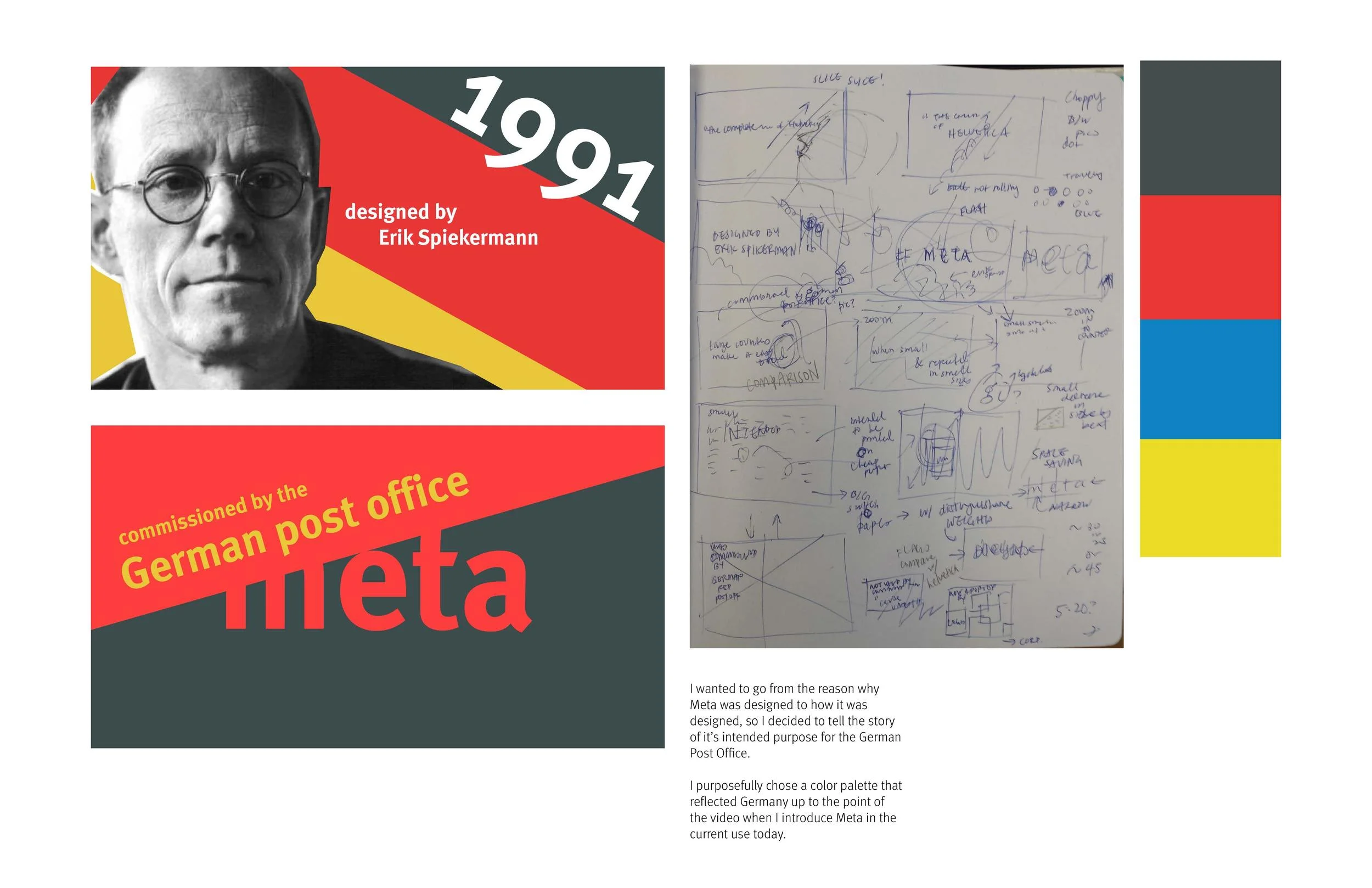
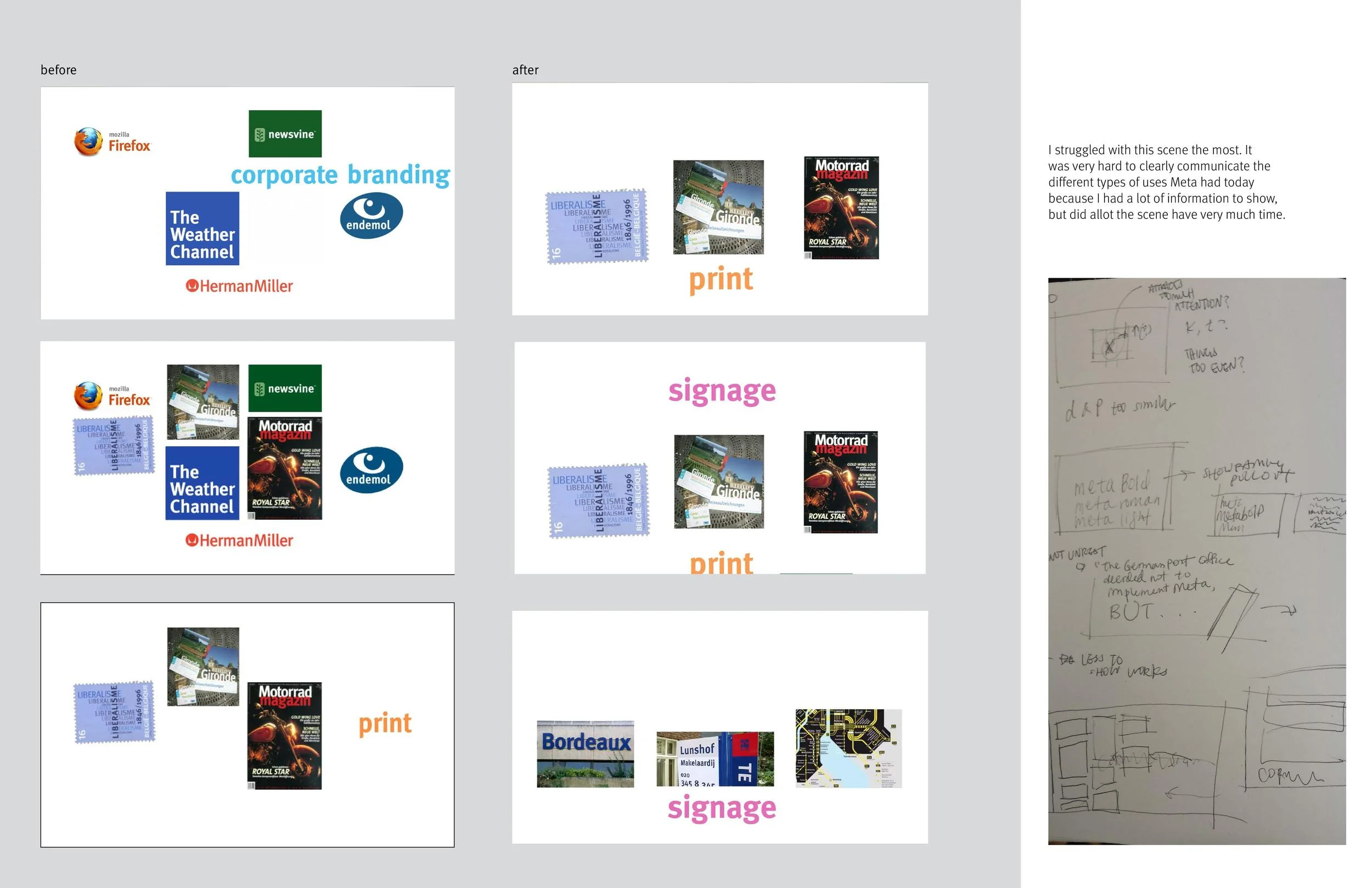
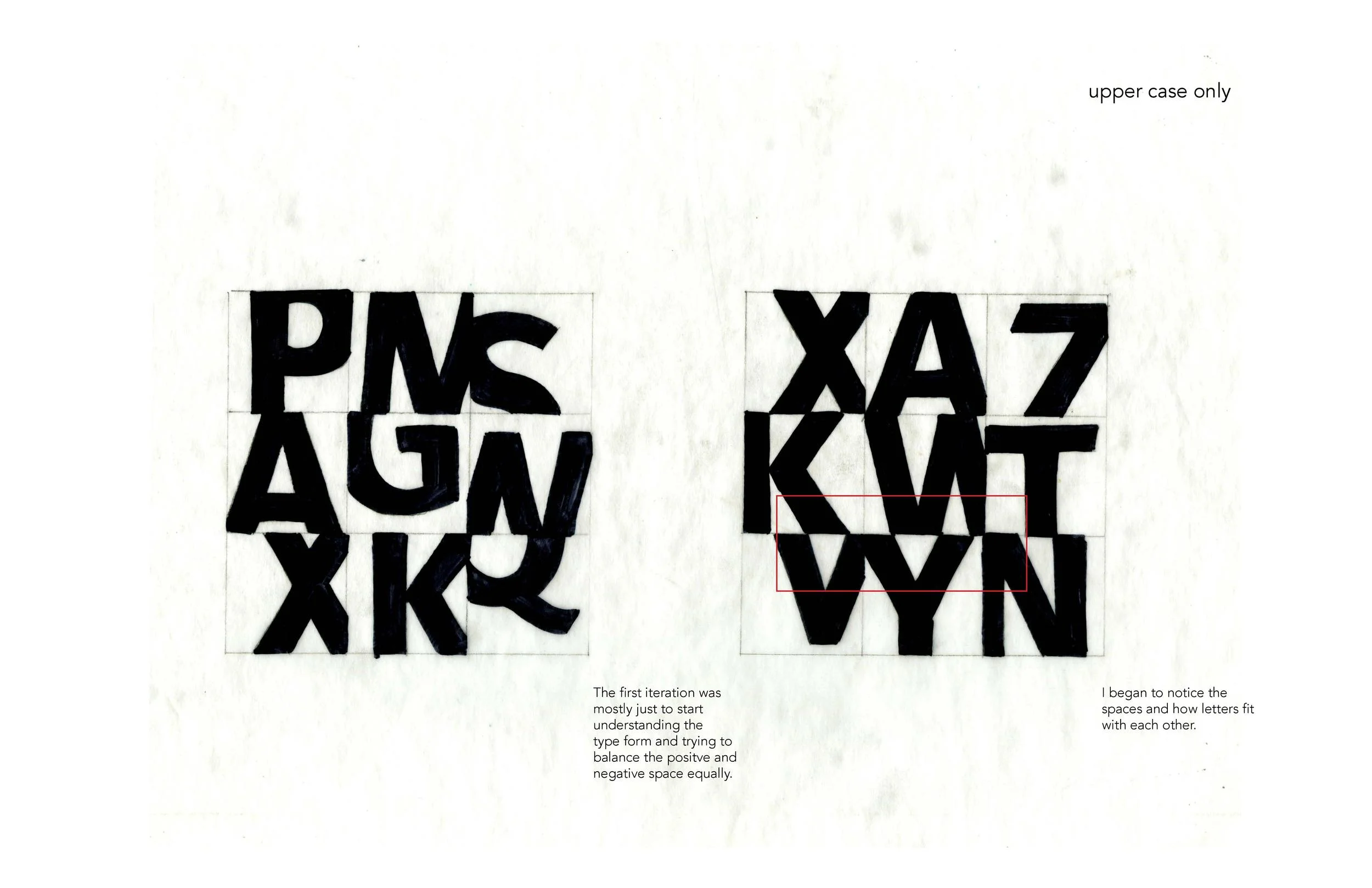
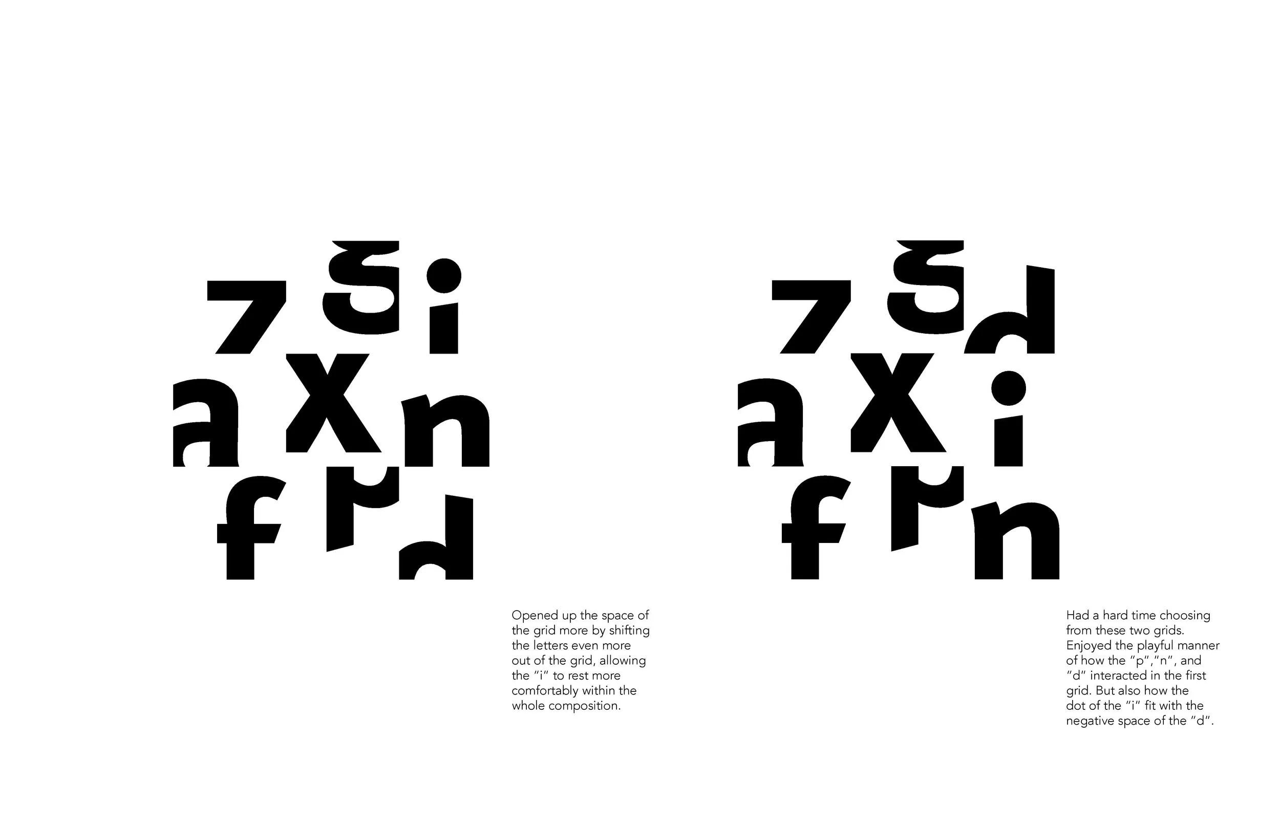
In this in depth type analysis, I studied the Meta family and specifically Meta Bold Roman. I first got to know the letter forms of Meta by tracing and observing the similarities that branched across the whole family. From there, I built an interesting grid composition that showcased distinguishing characteristics of the Meta typeface. Finally, I created a video to tell Meta's story of why it was designed and how it is used today.
Storyboards for the video:
Explorations for the grid composition:


